Tuesday, April 28, 2015

Our Animation Story


Our story is about a girl named Tu who get's cyber bullied, she begins to get very sad and depressed. Her friends begin to notice and ask her what's wrong, she tells one of them and she starts to feel a little happier. The cyber bully continues to cyber bully her but eventually her and her friends find out who the cyber bully is and tell him to stop and he stops. Our focus statement is "Cyber bully affects Tu" this tells our story very clearly I think.

I think our audience will learn that it's better to tell someone if you are getting cyber bullied. I think they will get this message because when Tu tells her friend she is a lot happier and feels better. When the bully confronts her again, Tu is able to stand up for herself, the bully eventually stops bullying her. I think our audience will also learn that they are perfect the way they are and to not let other people get to you.  I think they will learn this because in the end the bully tells Tu that she's ugly.  Tu tells him that she doesn't care what he thinks and that she's happy with being herself.


I think the worst moment with my team was probably when we were filming, we just started filming without actually doing the storyboard. Not doing the story board made it hard to figure out what to film and how to lay it out.  I think the best moment our team had was when we turned the project in fully completed and looking very nice. 


Wednesday, April 15, 2015

Animation Outtakes

In my team I have Dylan, Tyler, Leilia, and Tu, we are telling Tu's story about her being cyber bullied. Dylan is amazing at poetry and is a very hard worker. Tyler is also a very hard worker but make everything a lot more fun. Leilia is funny and extremely fun to be around she tries as hard as she can and the end result is usually pretty great! Tu is a very fun person to be around, she is always smiling and she is extremely photogenic and she's really pretty!
\
Stop-motion is a type of animation that makes a set of images look as if they're moving. GIF means Graphics Interchange Format, this is another type of animation.  These animations are usually drawings and many animators use them.  Animators typically start by learning the bouncing ball like what I have made here:


We are telling Tu's story about when she was cyber bullied, cyber bullying is probably one of the greatest problems for kids in middle school and high school, Cyber bullying could be a simple accident, you could read or misinterpret a text message very easily! People all around the world are committing suicide because of cyber bullying and we just want to send the message out there that you need to talk to someone and that you should be careful when you are texting.  

Thursday, March 12, 2015

Typography Images

Typography is the style and appearance you make your words or text.  Typography is also like kerning, arranging the space between the words or letters in a text.  When your kerning you can also make the words curved up like a smile, or down like a rainbow.  When you are using typography it make an impact because, it can describe a person to you using only a few words instead of using a lot of words that you a lot of times don't understand.  Also when you  are creating a typography portrait it makes the picture look a lot more interesting, especially when you take the colors from the image and use it in the words, making the words look like they are part of you.

I think my biggest challenge during this project was having no help, I think I lean on people too much.  I'm also not very good at reading a tutorial then trying to do that.  I had to read the tutorial over and over again till I finally got it.  Once I figured out what the tutorial was saying it was actually really easy to do.  I know that when we do another one of these projects I will get it better.  The other problem I had was making it so that their was less mid tones and more shadows and highlights.  It took a long time to get it right and make it so that you can see all the features in Mrs. Sampels face.  


The first typography we did was of an innovator, I chose Marissa Mayer, she was the first woman to ever work for Google.  I don't really like this image, because you can't really see her face and it just words on a black background.  The second typography picture we did was of a teacher of our choice.  I chose Mrs. Sampels, my social studies teacher.  We had to talk to them and get the words to put on the picture.  I like this one a lot better because it's really colorful and you can see the words better.  This project was hard, but I like the final product so I might try to make another one soon.


Monday, February 23, 2015

Double Exposed Portraits

A portrait is a picture is a picture of someone, these pictures include both eyes and their entire face.  Portrait pictures can show your mood, personality and you can show expression.  A profile picture is the side view of someones face, one eye instead of two.  Silhouetting is a profile picture but its completely black and you can't see certain features on the face.  Profile pictures and silhouetting are similar to portrait pictures because, either way you can still tell what the person looks like or a sense of what they look like.  For example, you can tell if they have a big nose or a smaller nose, you can tell if they have a pointy nose or a rounder nose.  You can also tell how long their hair is or have a sense of what their hair looks like.

When you are creating a double exposure picture, you have to go File > Script > Load Files Into Stack. Then you choose the three pictures you want to use, the profile and the two images that you want to add.  When you open the photo's in photoshop you have to use the dodge tool outline then profile picture you're using.  When the entire background is white crop your image to the size you want, (8.5 " x 11") then change the profile picture's blend mode to screen.  Change the other images blend mode to one that you think looks cool, or what you want it to look like.  Move and size your picture till it's the way you want.  Add adjustment layers and explore to find what you want! I think these Double Exposure picture are really cool! You can also put anything you want in your profile, so you can put things that symbolize you.


I love reading and writing, so I took a picture of words.  I also talk a lot and I'm a very social person so that's also what the words mean. I'm generally a very happy person and I feel like the sun is a good representation of happiness.  I also love the colors yellow and orange, because of their brightness.  I think I could have made the words so you could see them a little better and made them have meaning instead of just words.  Other than that this image is exactly what I wanted for my Multi Exposure picture. I also cut my nose off a little when I was using the dodge tool. I loved this project and I know that I will do another one as soon as I can!


Monday, January 26, 2015

HDR Photography

HDR Photography is when you take a series of pictures from low exposure to high exposure and combine them together to make the colors prettier and more vibrant.  It also makes the bright spots and dark spots stick out more.  I like HDR photography because it makes the pictures really detailed and it makes the colors really nice.  I don't like how we can't have lots of movement otherwise there's ghost's when you merge them.  I also don't like how sometimes HDR pictures look really fake and they sometimes look like paintings not pictures.

You create and HDR images by taking an image from low exposure to high exposure.  You have to make sure not to move the camera otherwise it won't align with the other pictures.  After you take the series of picture and it is what you want it to look like.  Open Photoshop (that is what my class and I use.)  When you open Photoshop go to file > automate > merge to HDR, select the series of photo's you want to use. Then you can customize the photo till it looks like what you imagined it to look like.  This is different from automatic HDR functions, like you can find on your smartphone, because you get to adjust the settings and create the picture you wanted.  When you take a picture on your smartphone and you have the camera set to HDR, it spits out and image. A lot of times when my phone spits out an image it doesn't look like what I want it to look like.  So, I prefer taking a series of picture and adjusting it because when I take the photograph I have this image in my head and most of the time I can make the picture look like that by adjusting the settings.

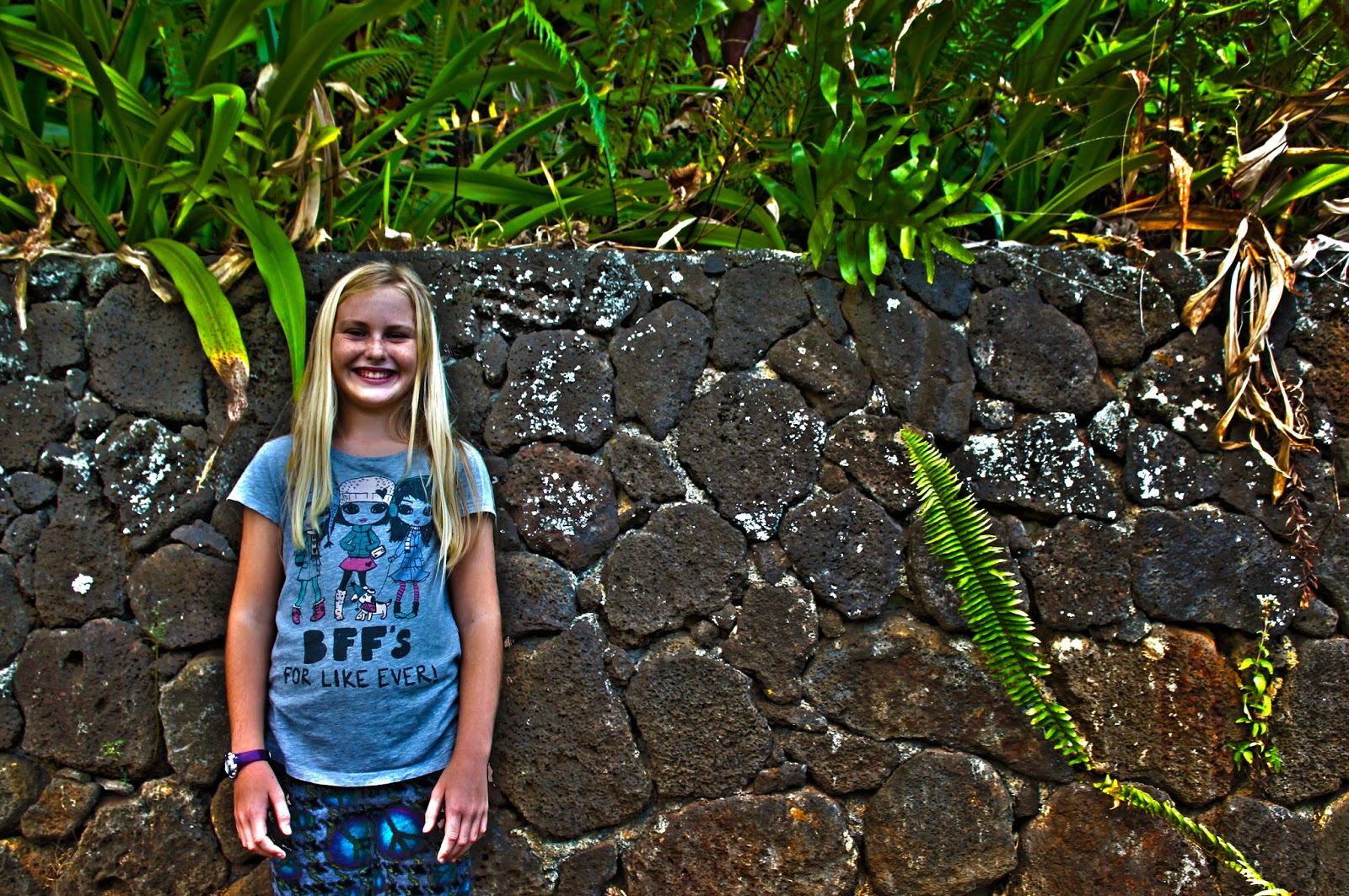
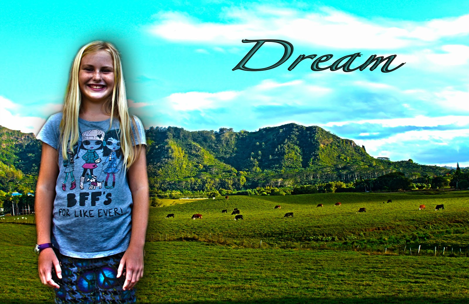
When I was taking the experiment picture of my sister, I didn't want to do it on a blank wall.  I decided to take it on the rock wall near my house, I decided to do it there because there's a lot of interesting things on and around the wall.  There is the ferns coming up from the sides and the wall has a lot of different colors and shapes.  The wall also has moss growing on it which  makes the wall look more interesting.  When I was taking my landscape I wanted to have more of the foreground, but there was a fence and I didn't really want to fence in my shot.  So i moved the camera up so that it still had lots of the field but you couldn't see the fence.  When I was editing my landscape picture, I noticed the cows moved a lot and it took me a while to make it look the way it looks now.  I think I could have tried harder on the rule of thirds and placed the mountain in one of those cross hairs. I also could've thought more about rule if thirds when I was taking the portrait of my sister and made her facial expression something more interesting then a smile.  


Wednesday, January 14, 2015

Movie Trailer Critique


We were asked to create a movie trailer, this movie trailer could be from a movie we have seen or we could create our own.  My group and I created our own, it's about a girl who goes missing when she finds a picture of a ghost. This girls name is Annabelle, her best friend, Julie, goes out to find her. I wasn't the only one who worked on this project, my group also consisted of Meagan and Cara.  I was the voice actor,  I wrote the synopsis as well.  I also played Julie, Annabelle's best friend who goes to find her when she goes missing.  Me and Cara also filmed most of the scenes that take place in school, while Meagan edited them to make sure we had all the requirements.


We were required to have special effects, a movie trailer poster with all of the requirements, at least five scenes, a voice acting script that was well rehearsed, text lay overs, music, foley and it had to be appropriate for kids in first grade. Our movie trailer was also supposed to be 1 minute and 30 seconds to 2 minutes and 30 seconds. We completed all the requirements, we had lots of effects that we used to make it scarier and have more of a ghost theme. We also all made a poster and then we chose which which one we wanted on our trailer. We chose Meagan's, hers had all the requirements. We had a lot more then five scenes, and we had a voice acting script, that was done by me. We had footsteps on the scenes where we were running away from something or to something. Our trailer was appropriate for the audience, but I think we could've done better.

Our class voted us mostly satisfactory, I agree with my class. I think we could have done better and made it so that the plot was more clear than it is in our trailer. I also feel like we repeated the same scene over and over again just in different places. We had a lot of running, whether it was a shot of the feet or a shot of them running from far away. We also had a lot of scenes of the picture blowing away. I think we could've had one scene of the picture blowing away then have like blacked out or something. I also feel like we could have done a little better with the audience we were making the trailers for. I think we could have made a movie trailer that first grade kids wouldn't be scared of, or something they would have enjoyed. Other than theses things I think we did a pretty good job, I enjoyed making this movie trailer.

Tuesday, December 16, 2014

Movie Poster Promo

Annabelle is the main girl in our movie trailer, she is a young girl who lives on the country side. Annabelle is a sweet, quiet, shy girl, one day she finds an old picture in the attic of an old abandoned house, the picture has a ghost in it. Annabelle is played by Cara Griffin, Cara is a perfect actor for Annabelle. Annabelle get's kidnapped by the ghost as she's about to tell her parent's about it. Julie is Annabelle's complete opposite, she is loud, fun and all she ever wants to do is go on adventures. I play Julie, I am a little louder and I like to have fun. Our last character is The Ghost Of 229th street, the ghost lives in the old abandoned house on 229th street. The ghost doesn't want anyone to know about his existence so he kidnaps Annabelle, when she is about to tell her parent's about him. 

Our title is 229th Street, it is called this because the ghost is from the abandoned subdivision that used to be called 229th Street. When the Ghost of 229th Street kidnaps Annabelle he brings her to 229th Street. I included the actors as well as the name of the character they play, I also included some of the things critic's said about the movie. I also included the actresses and the roles they play in the movie. Here is my progress so far I have made the font of the title look like a address that you would find on the side of a house/ building.  On my title I also added the effect drop shadow and that makes it look like the words are coming off the page and creating a shadow.  I also included the date the movie is coming to theaters. Kerning can be pretty easy but it is also hard because you just have eye it and see if it looks right.  I made the letters in "Scream Studios" really far apart so it looks like it does in a lot of different movie trailers and movie posters.


I used the drop shadow layer affect on the main picture and on the title. The drop shadow makes it look like the words and the picture are coming off the page. It gives it character and makes it look really cool.  I also included the stroke layer affect on the title, the critiques, and the actors and actresses. The stroke makes the white font easier to read and it also makes the poster look really nice. I cut out the ghost form another picture and added it to this picture, this made it so that we had the ghost hiding and it looks like it's going to scare Anabelle at any second. I also made the ghost brighter, it was really dark and would've been really hard to see.