You create and HDR images by taking an image from low exposure to high exposure. You have to make sure not to move the camera otherwise it won't align with the other pictures. After you take the series of picture and it is what you want it to look like. Open Photoshop (that is what my class and I use.) When you open Photoshop go to file > automate > merge to HDR, select the series of photo's you want to use. Then you can customize the photo till it looks like what you imagined it to look like. This is different from automatic HDR functions, like you can find on your smartphone, because you get to adjust the settings and create the picture you wanted. When you take a picture on your smartphone and you have the camera set to HDR, it spits out and image. A lot of times when my phone spits out an image it doesn't look like what I want it to look like. So, I prefer taking a series of picture and adjusting it because when I take the photograph I have this image in my head and most of the time I can make the picture look like that by adjusting the settings.
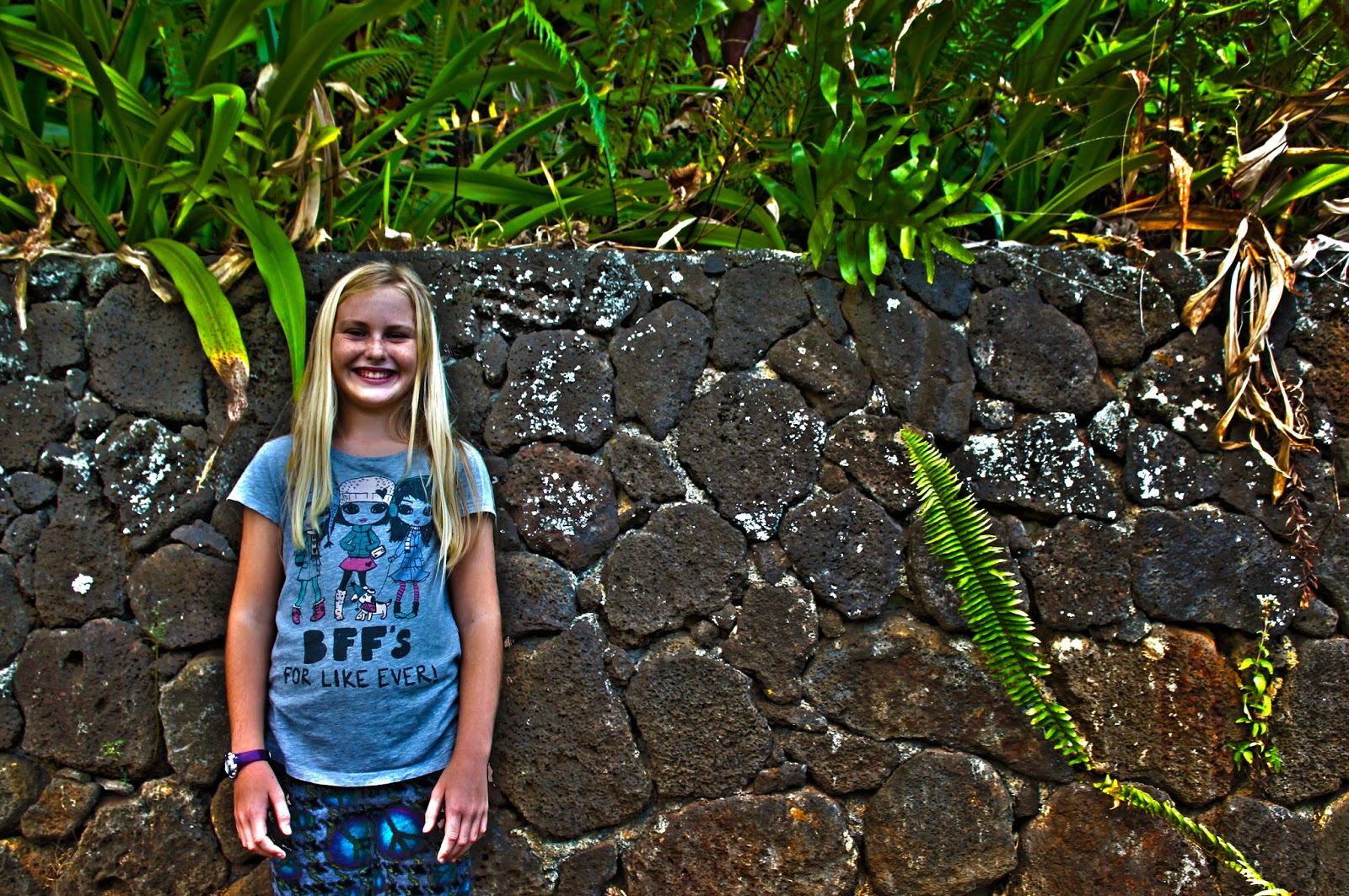
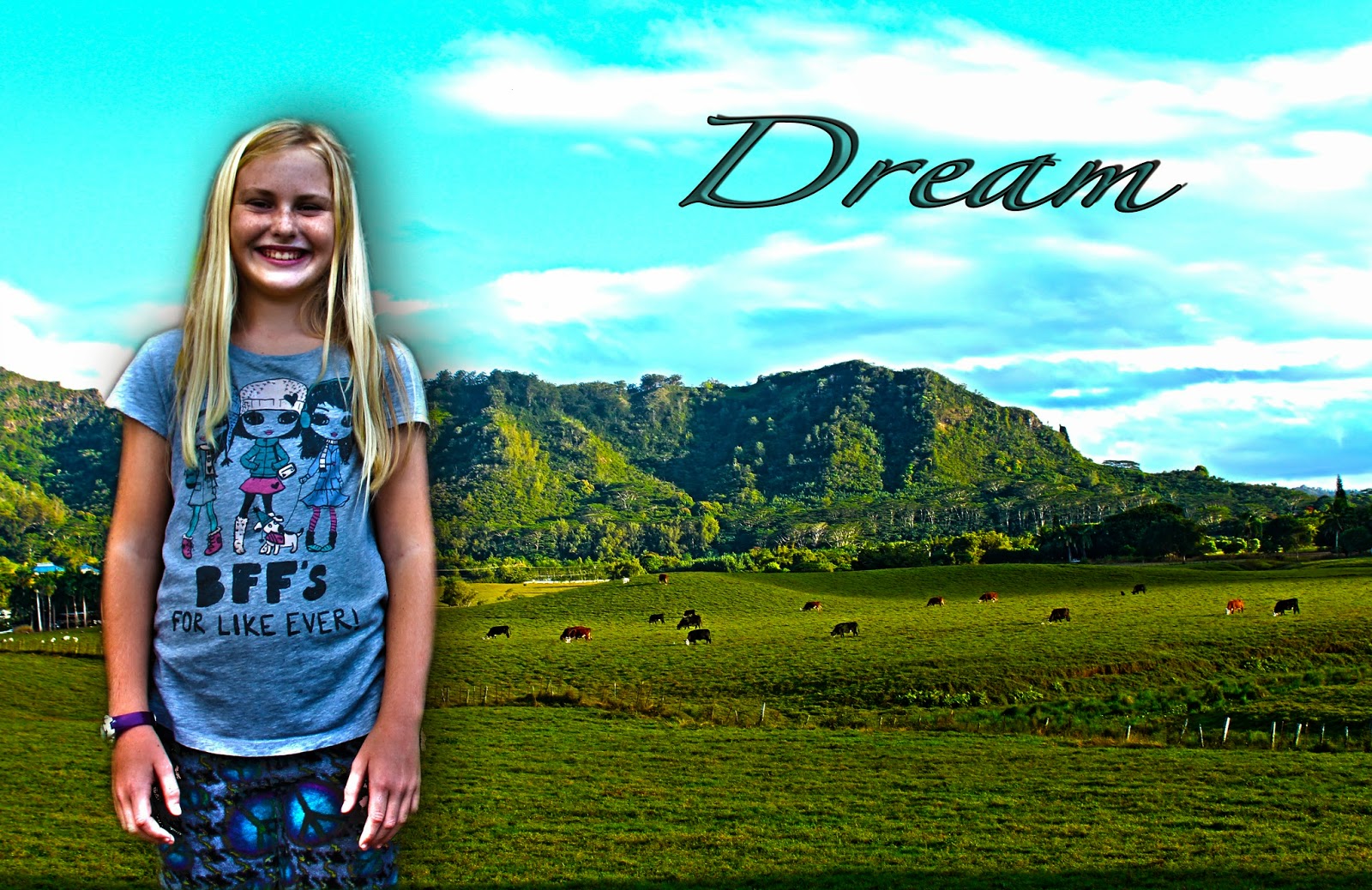
 When I was taking the experiment picture of my sister, I didn't want to do it on a blank wall. I decided to take it on the rock wall near my house, I decided to do it there because there's a lot of interesting things on and around the wall. There is the ferns coming up from the sides and the wall has a lot of different colors and shapes. The wall also has moss growing on it which makes the wall look more interesting. When I was taking my landscape I wanted to have more of the foreground, but there was a fence and I didn't really want to fence in my shot. So i moved the camera up so that it still had lots of the field but you couldn't see the fence. When I was editing my landscape picture, I noticed the cows moved a lot and it took me a while to make it look the way it looks now. I think I could have tried harder on the rule of thirds and placed the mountain in one of those cross hairs. I also could've thought more about rule if thirds when I was taking the portrait of my sister and made her facial expression something more interesting then a smile.


